Finding the data that matters for 20M+ people
Company
MetLife, one of the world's leading insurance and financial services companies (Insurance / Enterprise).
Product
MetDental’s Member and Provider Platform serves over 20 million members and over 130,000 in-network providers.
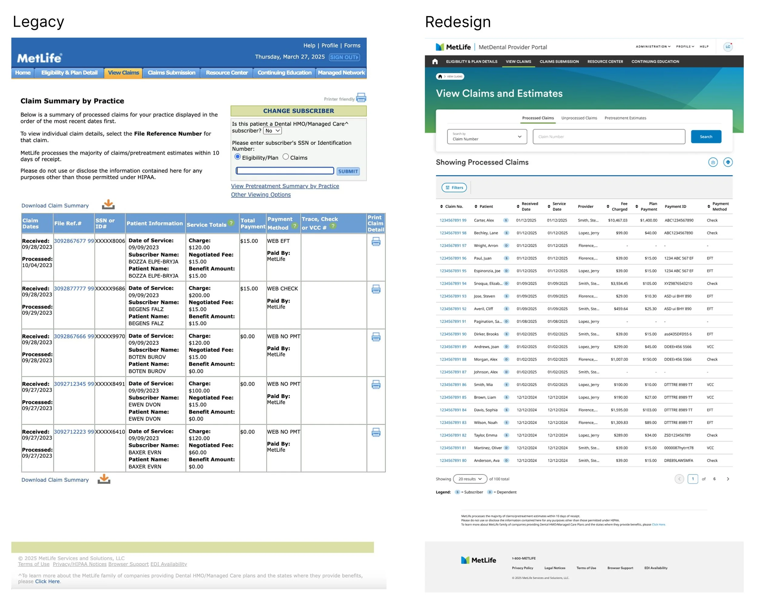
MetLife's legacy platform contained the information users needed, but buried the decisions inside dense, regulated claims and benefits data.
My role was to identify where the platform was creating the most friction, establish a customer and business driven design direction, and lead the redesign across member and provider experiences.
Overview
Role
Lead Product Designer, Dental Provider & Member Platforms
Team
3–4 Designers, UXR, Multiple PMs, Engineering, Business Leadership
My ownership: Platform design direction, prioritization, research partnership, workshops, provider platform and select member experiences
Leading a Team and a Platform Transformation at Scale
MetLife's dental insurance administers benefits for over 20 million people across a network of 478,000+ dental locations nationwide.
The platform supporting this ecosystem, used daily by providers and members alike was outdated. Navigating eligibility, claims, and benefits had become unnecessarily complex for both sides of the experience.
Every decision had to hold up against DPPO/DHMO regulatory requirements, not just usability standards.
The business had made modernization a top priority, and I was brought in to lead both the design team and this large scale initiative simultaneously.
While I owned the provider platform redesign end to end, I also oversaw a team of designers each running their own parallel work streams across the member experience.
Diving Deep into Research
How do you turn a compliance checkbox into something people actually understand?
We needed to identify the highest value problems in a complex platform and use customer evidence, business goals, and technical reality to decide what to fix first.
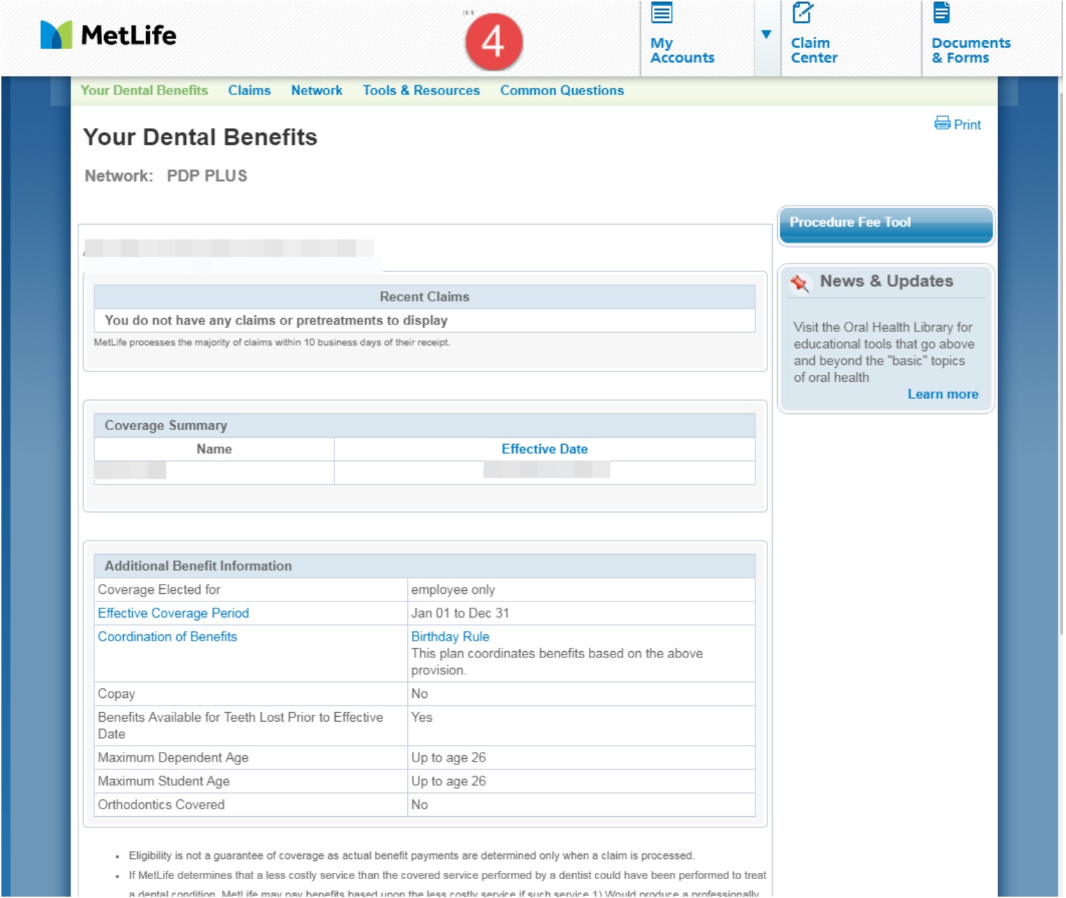
I kept running into dense, regulated information reduced to a flat yes/no with no explanation, and a real cost when someone got the signal wrong. A benefits page that just says "Orthodontics Covered: No" is technically complete, functionally useless.
The Customer Problem
Multiple audiences, multiple needs.
Members needed reassurance
Coverage, cost, and eligibility questions at the exact moment someone is deciding whether to get care. Clarity wasn't a nice to have, it changed real decisions.
Providers needed speed
The same underlying data, but at volume, across every patient on their books. What took a member five minutes to read had to take a provider five seconds to scan.
Compliance wasn't optional
DPPO and DHMO plans carry different rules for nearly everything, coverage percentages, frequency limits, incentives. The "right" data depended on which plan you were looking at.
The challenge was determining which complexity users needed to understand, which complexity the system needed to enforce, and which complexity was simply a consequence of the legacy platform.
I partnered with compliance, legal, product, and engineering to make those distinctions throughout the redesign.
How I approached the problem
The platform had more opportunities than the team could realistically tackle at once. My role was to establish where design could create the greatest customer and business impact, then personally drive the highest-risk problems from discovery through execution.
I partnered with product, engineering, UXR, compliance, and business stakeholders to evaluate initiatives against customer impact, business value, technical feasibility, and UX effort.
I used that framework to prioritize six parallel workstreams and facilitate decisions when stakeholder priorities conflicted.
I also owned several of the highest-risk initiatives directly, including Orthodontics, the Provider Resource Center, and the provider platform redesign.
The member side work streams included:
Orthodontics: A 0→1 experience for members
Member Dashboard Redesign: Improving the core member home experience
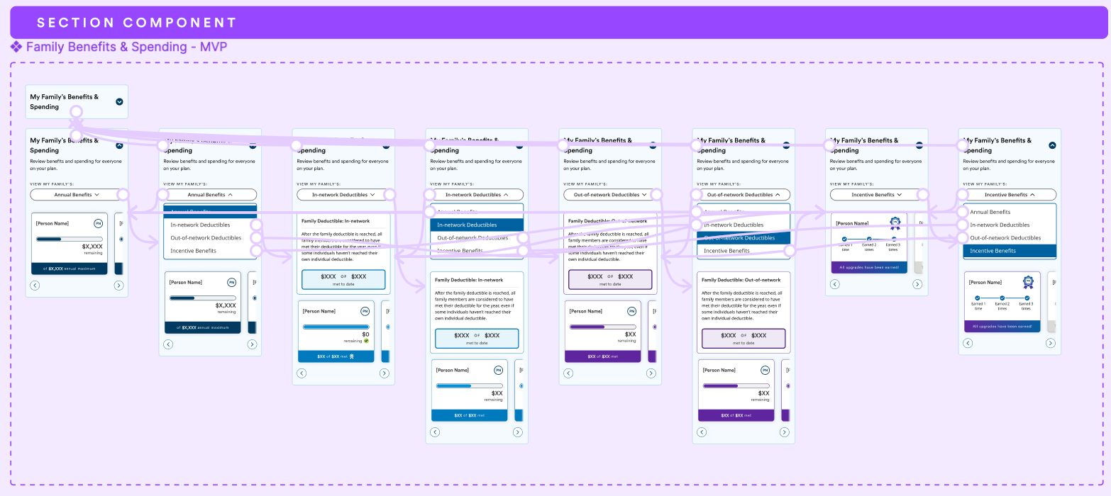
Family Benefits: Surfacing benefits clarity for families
Opt into Paperless: A behavioral nudge initiative I also led directly
I owned the provider side work streams that included:
Resource Center: A 0→1 content hub I also led directly
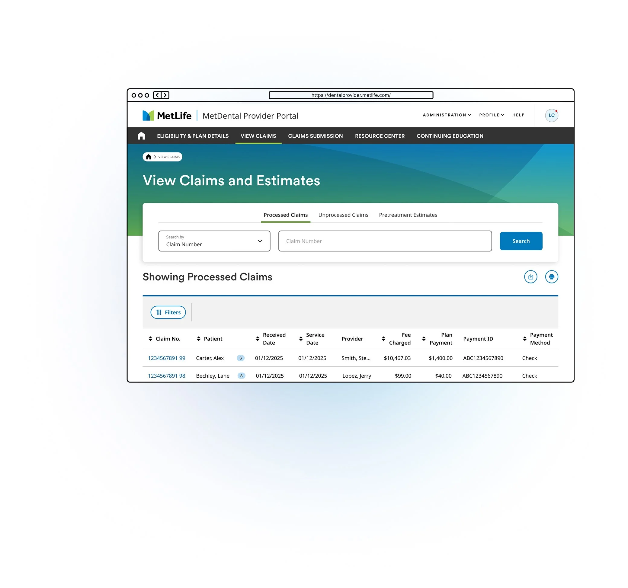
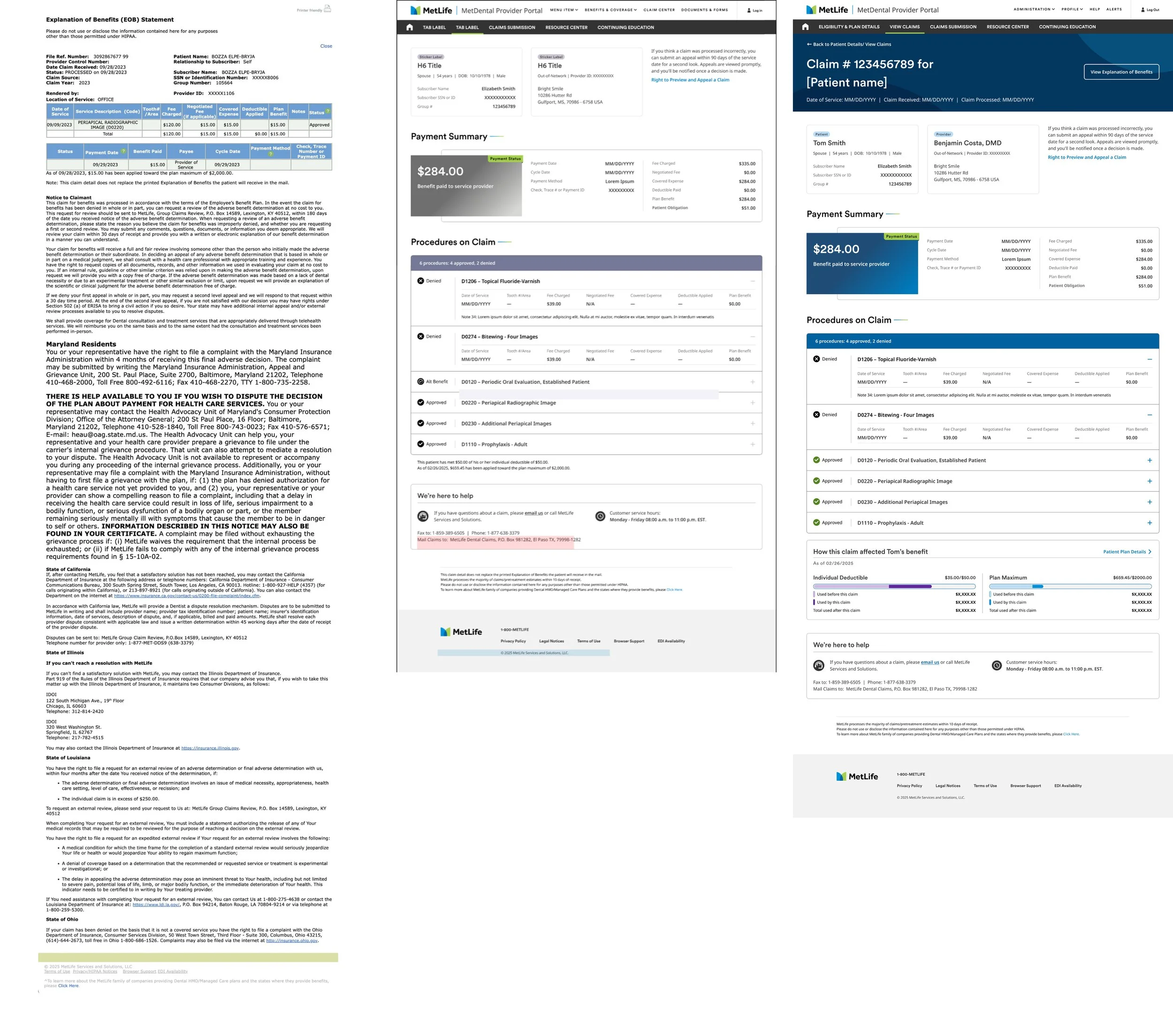
Redesign of Legacy platform: A complete redesign of MetDental for providers
Replacing competing opinions with a shared decision framework
Before I introduced a shared prioritization framework, priorities were being set in two places that didn't talk to each other.
UX driven priority ranking and business driven priority ranking for the same initiatives, ordered almost in reverse of each other.
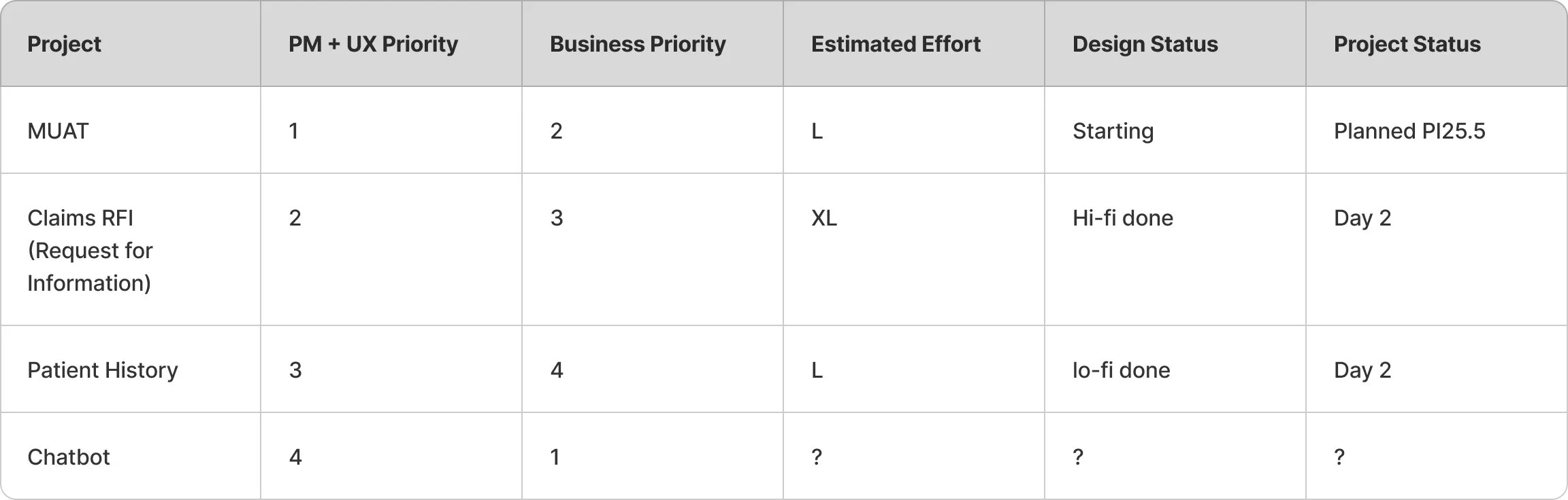
I worked with PM and engineering to create a shared prioritization framework that made customer impact, business value, technical feasibility, and UX effort visible in the same conversation.
Facilitating alignment without letting the loudest voice choose the direction
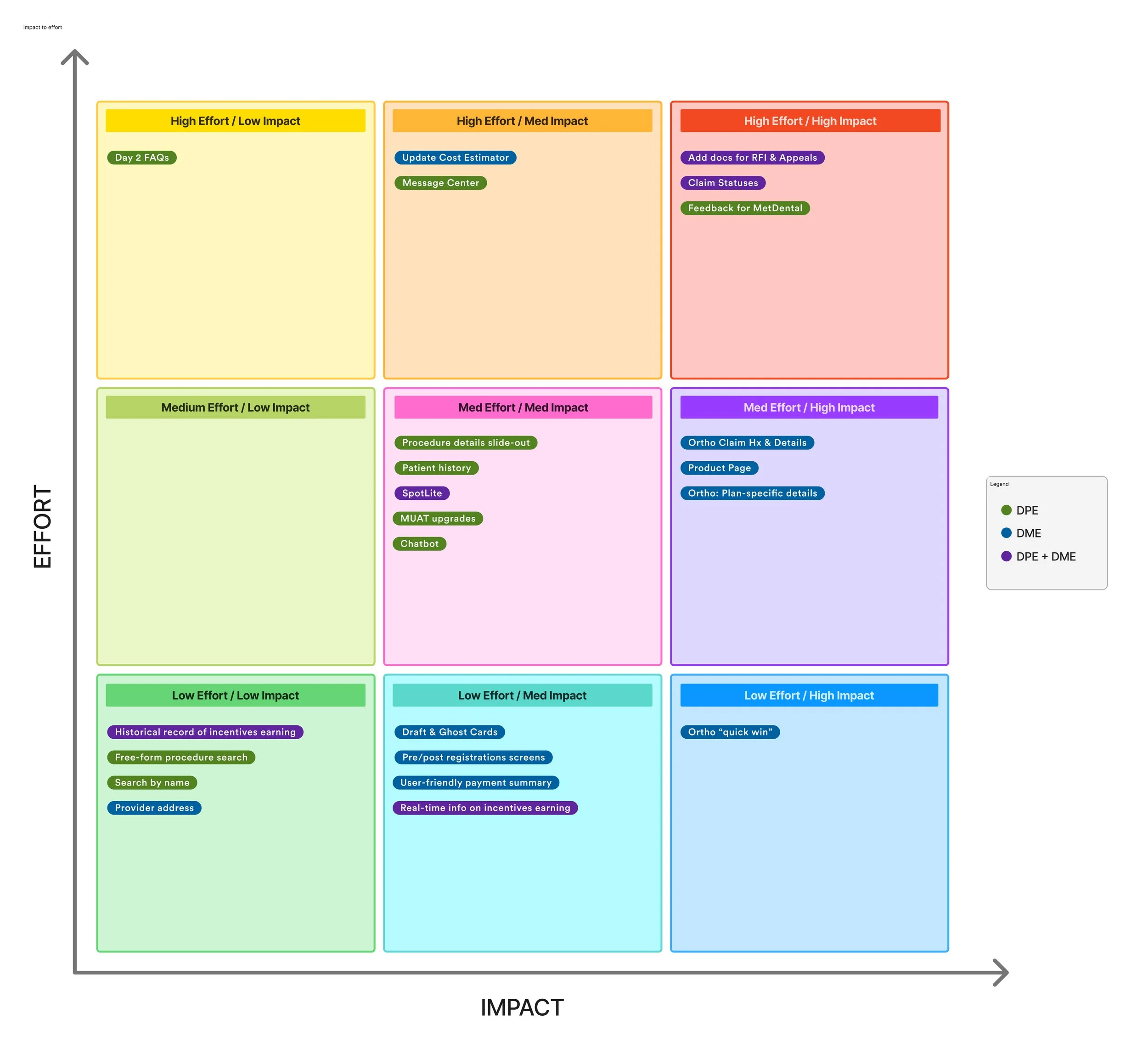
I facilitated workshops for stakeholders to plot initiatives together, in the same room, replacing disconnected lists with an artifact for everyone to share.
When stakeholders had competing priorities, I structured workshops around explicit criteria rather than open-ended debate.
Each stakeholder contributed independently before reacting to others, then we plotted initiatives against shared impact and effort criteria.
The goal was to create a transparent decision process where disagreements could be surfaced, evaluated, and resolved.
The output wasn't consensus. It was a decision the team could explain and move forward with.
A System for Running Parallel Work streams
I created a lightweight cadence for surfacing blockers, open questions, and cross functional decisions across the six workstreams.
The goal was making sure design, product, and engineering could resolve issues before they became delivery problems.
Research was how we made product decisions
I worked with UXR to identify the highest risk assumptions before investing heavily in design.
For each research effort, we defined:
Hypothesis: What did we believe would happen?
Success criteria: What evidence would increase or decrease our confidence?
Method: What did we need to observe or measure?
Decision: What would we change based on the findings?
I wasn't treating research as a validation step after design. The findings determined which direction we pursued next.
The dental coverage homepage
Redesigning around what brings people value and peace of mind
Concrete moments
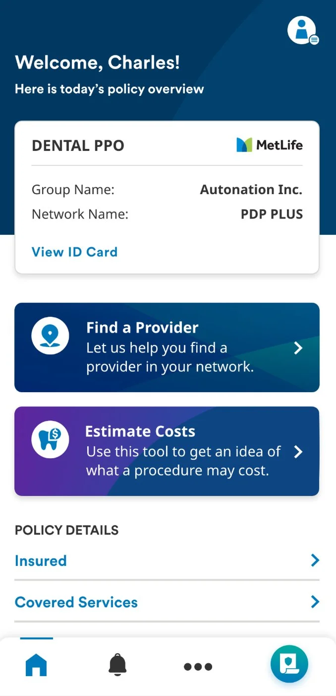
This is the landing screen every member hits first, where they land coming out of their accounts overview into the dental experience.
It's the highest traffic screen in the platform, and it was carrying a lot of things nobody was actually using.
Behavioral data told us what deserved priority.
🎯 Decision driver
Users consistently went to the cost estimator first when planning treatment, it was the primary decision anchor, not a secondary tool.
🏠 Homepage value
Coverage summary and cost estimator ranked as the most important homepage elements.
Leveraging workshops to frame the problem before designing the solution
Rather than beginning with screens, I brought UXR, engineering, product, and business stakeholders together to establish the problem, constraints, assumptions, and success criteria.
💙 Perceived value
In moderated testing, participants rated perceived value at 4.15/5.
We treated this as a directional signal rather than a statistically significant outcome. More importantly, the qualitative findings helped us understand why the concept was valuable and what needed to change.
Mobile Prototype of Dental Member Coverage
Orthodontia
Before this work, there wasn't an ortho explanation at all, just a flat "Orthodontics Covered: No" buried in a benefits table.
What we knew
Ortho was a major call driver.
IVR data identified ortho as a top topic.
A flash survey identified it as the hardest benefit category to understand.
Eligibility research showed the deductible was difficult to find.Multiple teams had strong opinions on how to do it. I ran a workshop where everyone contributed before reacting to each other.
What we didn't know
Would showing a concrete cost story actually improve comprehension enough to change the experience?
From this I framed a design hypothesis:
If we replace the blank line with a concrete cost and dynamic story, members will better understand their orthodontic benefit and feel more confident about what it means for them.
A longer term business hypothesis was that improved self service could reduce avoidable orthodontia related support calls.
Success criteria
We wanted participants to:
Understand what their orthodontic benefit meant in practical terms.
Identify the relevant cost information without needing additional explanation.
Distinguish in-network and out-of-network costs.
Describe what they would do next with reasonable confidence.
I partnered with UXR to translate the product hypothesis into a research plan. I owned the product questions and design hypotheses; together we defined the prototype goals, session structure, and evidence we needed to make the next design decision.
UXR facilitated the moderated sessions and led synthesis, while I participated throughout the research process and translated findings into design changes.
Testing was remote, moderated sessions with 5–6 participants per round, roughly two weeks each: a week to define goals and prep, a week to test, then a readout that started with a quick summary before the fuller analysis followed.
Round 1: Test the core hypothesis
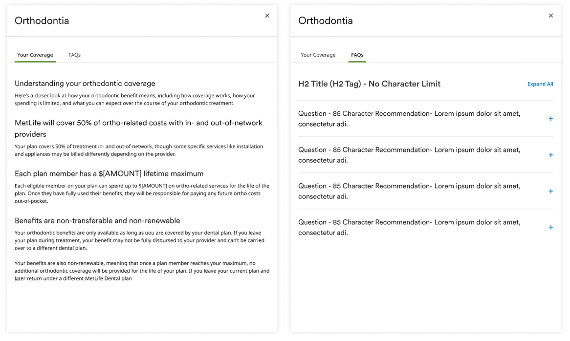
Cost driven story prototype
Quick implementation: A plain language policy explainer, coverage rules, and lifetime maximums, no worked examples.
Too abstract; members couldn't connect it to their own situation.
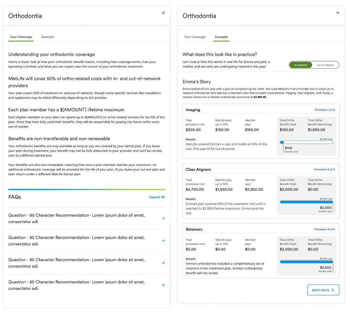
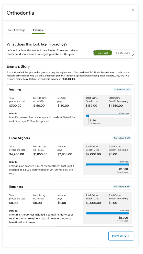
Winning direction: Two persona stories (Emma, Jake) walking their actual costs procedure by procedure, combined with an in network/out of network toggle on a single screen.
Findings: Participants could connect the information to their own situation more easily.
Design decision: Move forward with concrete cost scenarios and in/out of network comparison.
Round 2: Find the right level of detail
Could we provide more detail without making the experience harder to understand?
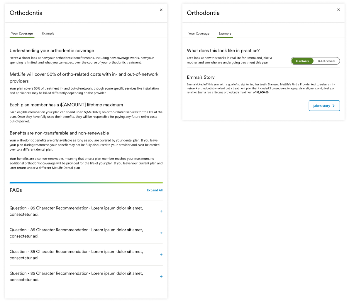
Simplified story prototype
Complete story and numbers breakdown protoype
Not well received: Simplified the narrative further, but lost the itemized costs members had responded to.
Not adopted: Went the other way with a fuller story plus a complete numbers breakdown, split into separate in network and out of network tabs with a full payment schedule ledger.
UXR's testing showed people lost the thread of the story trying to click through it.
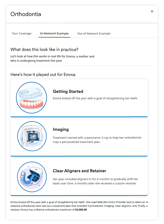
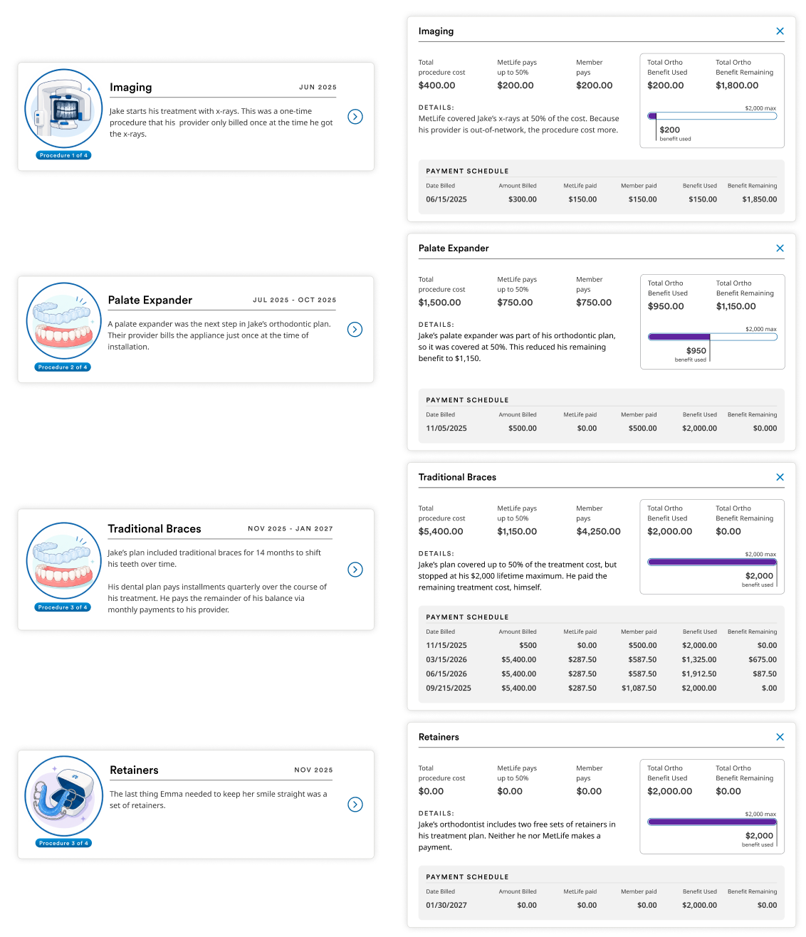
Findings: Participants lost the narrative thread while navigating the detailed breakdown.
Design decision: Preserve the concrete cost story while reducing the amount of information users had to navigate simultaneously.
Final direction: design around the data we could trust
Our ideal experience would have dynamically generated the story from each member's actual treatment plan.
That required data and development investment that wasn't available in the current product scope.
Rather than designing around data we couldn't reliably access, we chose the smallest useful experience that could be supported by the platform today, while preserving a path toward deeper personalization.
The operating principle became showing meaningful information with the data we actually had, instead of waiting on a fully personalized version we couldn't build yet.
When engineering surfaced something the design didn't account for
The design process didn't end when the prototype was approved. Engineering was part of the product discovery process because technical constraints could change the right solution.
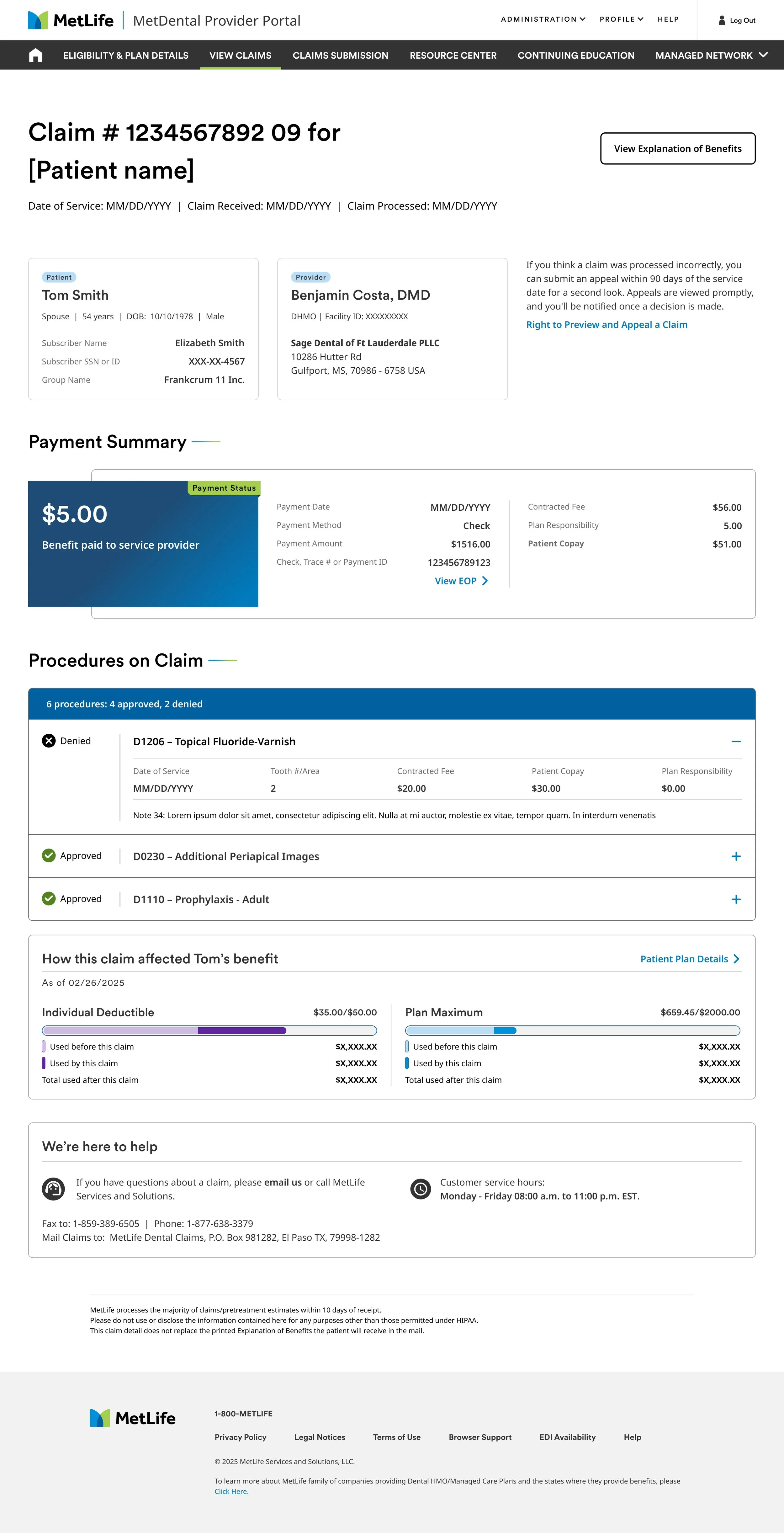
Claim statusing was the single highest effort item on the entire roadmap, and it didn't ship from a fixed spec.
New requirements kept surfacing in the code as engineering got further into it, and design adjusted the same week, not the same quarter.
Design assumption
Show patient specific ortho benefit detail directly in the claim view, it's one of the highest drivers of support calls, so it should be there.
What we shipped instead
Engineering flagged that patient specific data wasn't available at the API level yet. We scoped the MVP around what was actually buildable, and staged the fuller version as a fast follow once the backend caught up.
That was the value of the twice weekly sync. Not reporting status to engineering, but being able to catch the gaps between design knowledge and what the system could do before it became a missed launch instead of a scoped down one.
The result was a smaller, shippable MVP with a clear path to the fuller experience once the backend capability became available.
Outcomes
Impact of the work
🏗 Platform Modernization Prioritized
Full redesign of a legacy platform serving 20M+ members and 478,000+ locations.
🔬 Compliance
Sound workflows, without sacrificing usability. DPPO/DHMO policy logic designed in direct partnership with compliance and legal.
👥 Research → Design
Established hypothesis driven research as part of prioritization and design decisions across initiatives.
🎯 Prioritization
Created a shared framework used across six workstreams to evaluate customer impact, business value, feasibility, and UX effort.
What I learned
The hard part was never the screen.
Making dense data legible was only part of the problem. The harder problem was determining which information mattered, establishing evidence for that decision, and creating a process where the evidence could change the direction.
Research helped us understand what mattered. Design turned those insights into experiences people could act on. Engineering helped us understand what the platform could actually support.
My role was to bring those perspectives together and turn ambiguity into a decision the team could act on.
The best product decisions weren't consensus decisions. They were evidence-based decisions made with the right people in the room.
My job as a designer wasn't to have the loudest opinion. It was to create the conditions for the team to make the right decision.