Finding the data that matters for 20M+ people who couldn't opt out of understanding it.
Company
MetLife, one of the world's leading insurance and financial services companies (Insurance / Enterprise).
Product
MetDental’s Member and Provider Platform serves over 20 million members and over 130,000 in-network providers.
MetLife's dental platform buried critical decisions inside dense, regulated claims and benefits data.
My job was making that data legible for members to decide whether they can afford a procedure, and for providers processing procedures at volume.
Every core member and provider flow shipped responsive across web, tablet, and mobile.
Overview
Role
Lead Product Designer, Dental Provider & Member Platforms
Leading a Team and a Platform Transformation at Scale
Team
3–4 Designers, UXR, Multiple PMs, Engineering, Business Leadership
MetLife's dental insurance administers benefits for over 20 million people across a network of 478,000+ dental locations nationwide. The platform supporting this ecosystem, used daily by providers and members alike was outdated. Navigating eligibility, claims, and benefits had become unnecessarily complex for both sides of the experience.
The business had made modernization a top priority, and I was brought in to lead both the design team and this large scale initiative simultaneously. While I owned the provider platform redesign end to end, I also oversaw a team of designers each running their own parallel work streams across the member experience.
How might we find the data that matters?
That's one of the questions I spent my time answering at MetLife.
Members weren't giving feedback about an entertainment app; they were trying to figure out if they could afford a root canal. Providers weren't browsing insights; they needed a claim status to reconcile before the next patient.
Same underlying problem, a lot of noisy, dense data, and a real cost to getting the signal wrong.
I'm walking through how I found that signal, what I personally owned versus what the team owned, where research changed my direction, and what I'd bring to a team facing the similar questions today.
Diving Deep into Research
How might we use behavioral signals to make design decisions that are measurable and tied to business outcomes?
We discovered
Behavioral signals in the data
UXR surfaced quantitative and qualitative patterns worth acting on across member and provider workflows.
We took action
Framed a design hypothesis
If we nudge this behavior, Y should improve. Every design decision tied to an expected, measurable outcome.
And got results
Outcomes aligned to the business
Decisions communicated to stakeholders with clear before/after expectations, not just user needs, but business value.
The Customer Problem
Multiple audiences, multiple needs.
Members needed reassurance
Coverage, cost, and eligibility questions at the exact moment someone is deciding whether to get care. Clarity wasn't a nice to have, it changed real decisions.
Providers needed speed
The same underlying data, but at volume, across every patient on their books. What took a member five minutes to read had to take a provider five seconds to scan.
Compliance wasn't optional
DPPO and DHMO plans carry different rules for nearly everything, coverage percentages, frequency limits, incentives. The "right" data depended on which plan you were looking at.
Structure of My Team
Owned end to end: Provider platform + Resource Center, discovery through shipped design, including the research plan, not just the screens.
Led across the team: Roadmap, prioritization, and cadence. I built and ran a shared prioritization framework, the weekly operating rhythm, and the research partnership model across all six workstreams.
Directed and helped execute: Orthodontics, Member Dashboard, and Family Benefits were owned by a dedicated designer I directed and unblocked, I set direction and ran alignment, I didn't push every pixel.
With a team of 4 designers, UXR, and UX Content designer, I assigned clear ownership by domain. A dedicated designer for the member experience and a dedicated designer for the provider experience. This gave each designer a single focus and accountability while allowing me to lead across both tracks.
The member side work streams included:
Orthodontics: A 0→1 experience for members
Member Dashboard Redesign: Improving the core member home experience
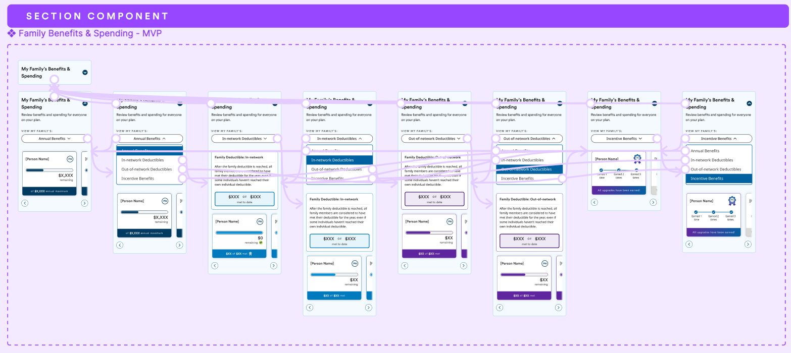
Family Benefits: Surfacing benefits clarity for families
Opt into Paperless: A behavioral nudge initiative I also led directly
I owned the provider side work streams that included:
Resource Center: A 0→1 content hub I also led directly
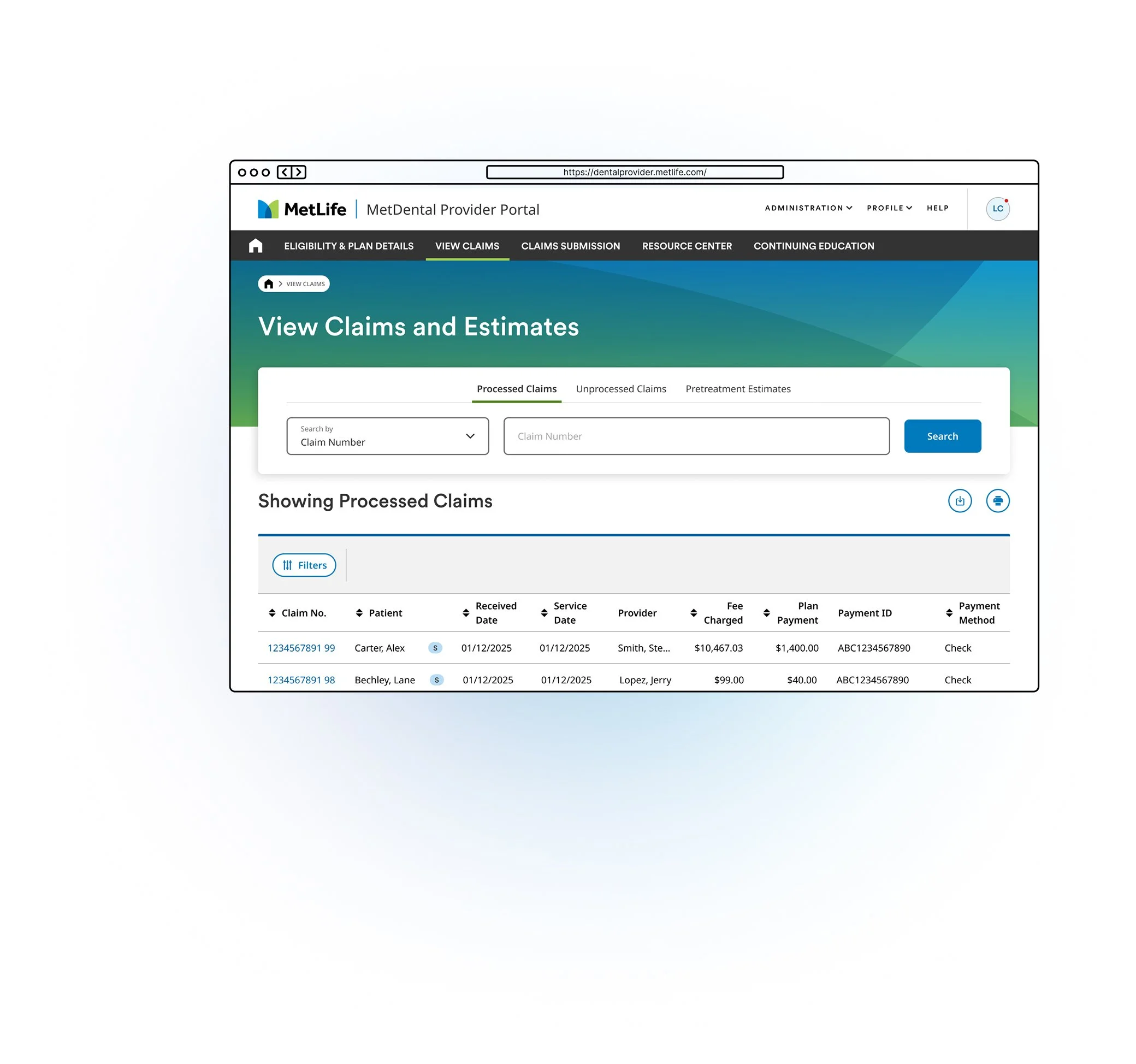
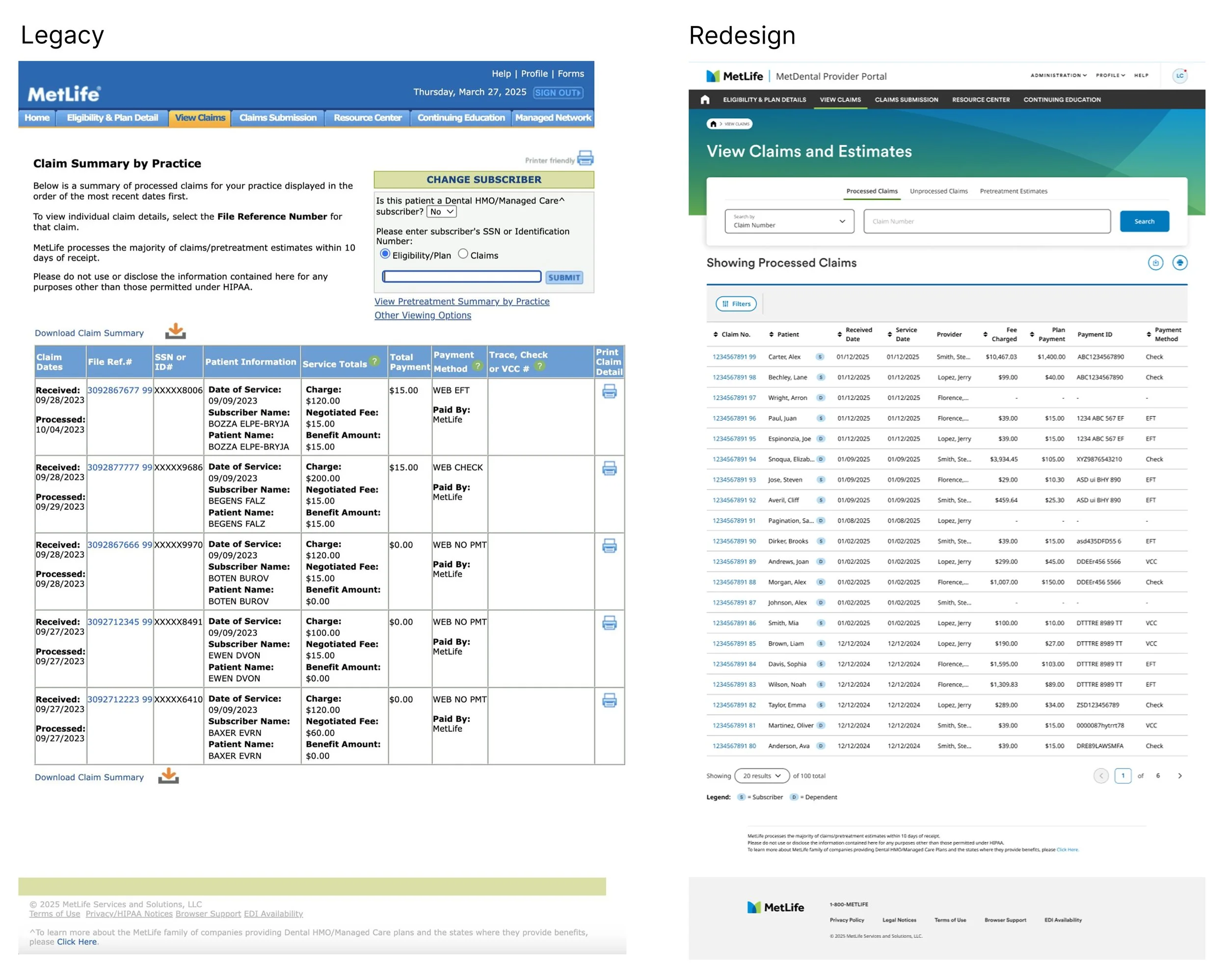
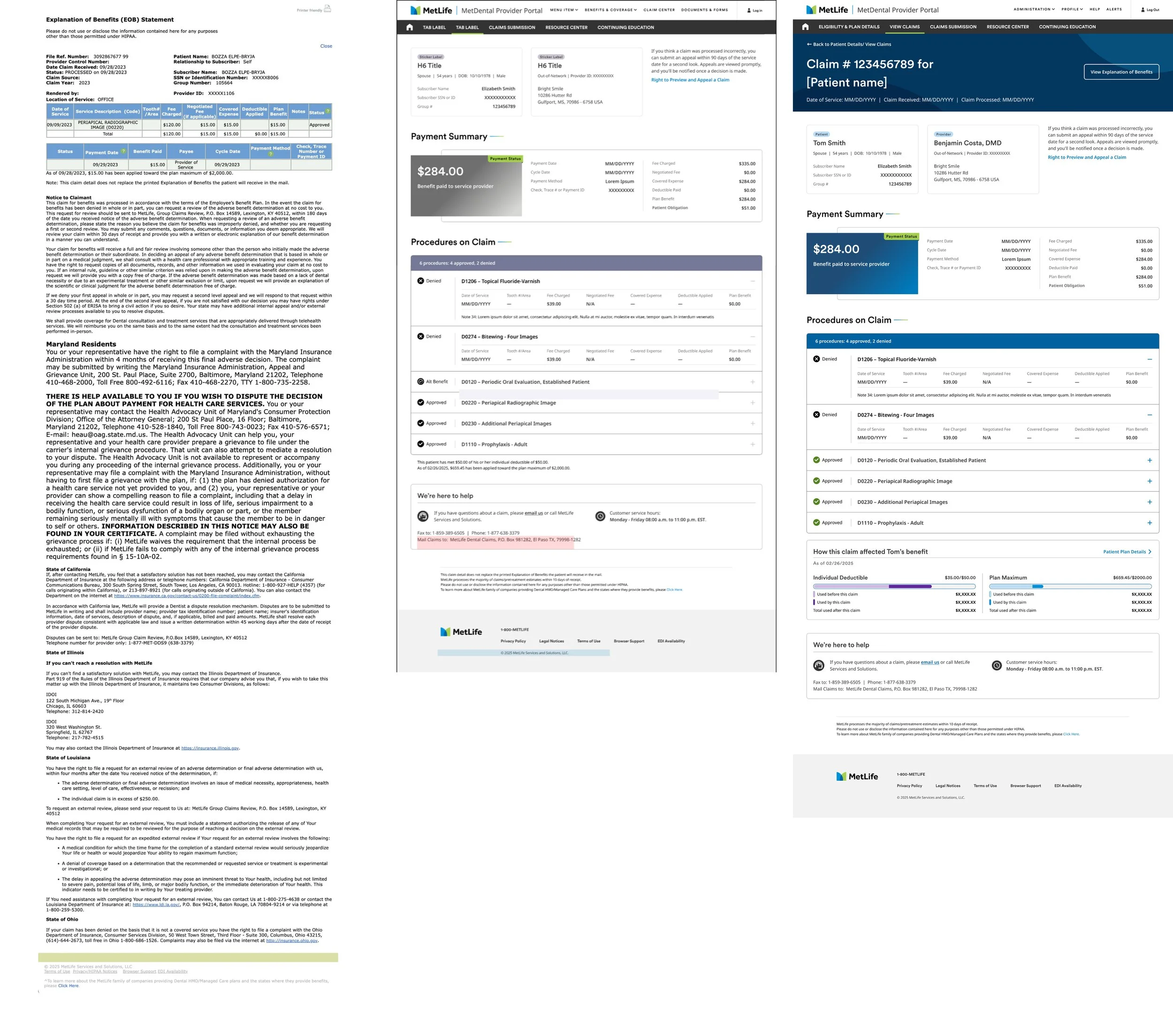
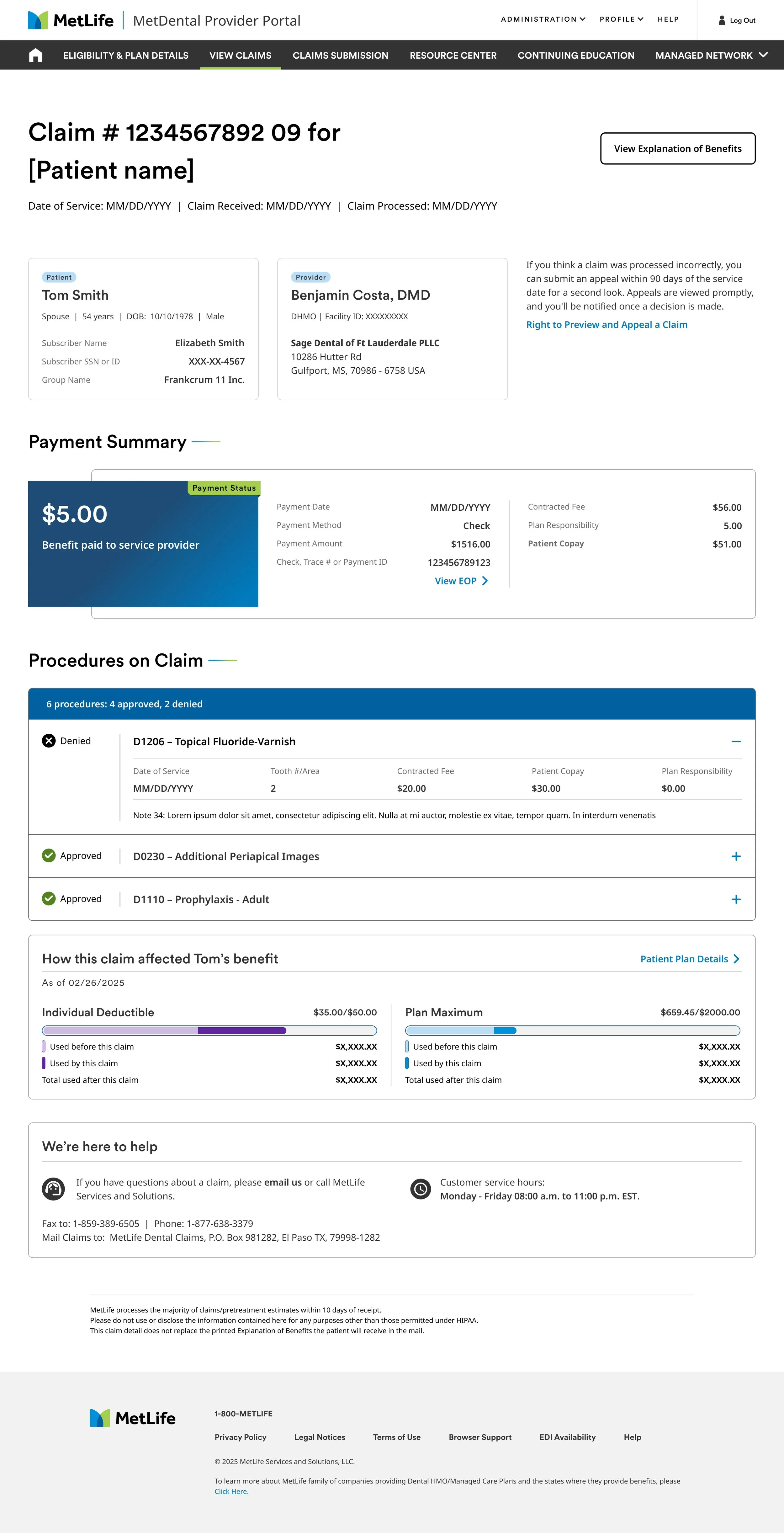
Redesign of Legacy platform: A complete redesign of MetDental for providers.
I built and maintained the roadmap across all of these initiatives, regularly presenting progress and priorities to leadership and the business.
Facilitation & Cross-Functional Alignment
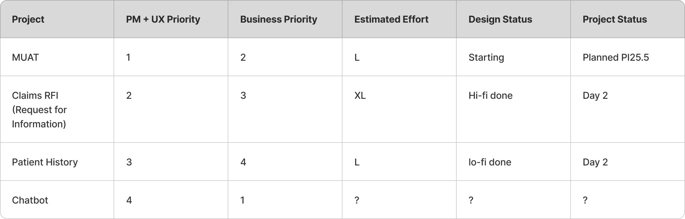
Before I introduced a shared prioritization framework, priorities were being set in two places that didn't talk to each other. A UX-driven priority ranking and a business driven priority ranking for the same initiatives, ordered almost in reverse of each other.
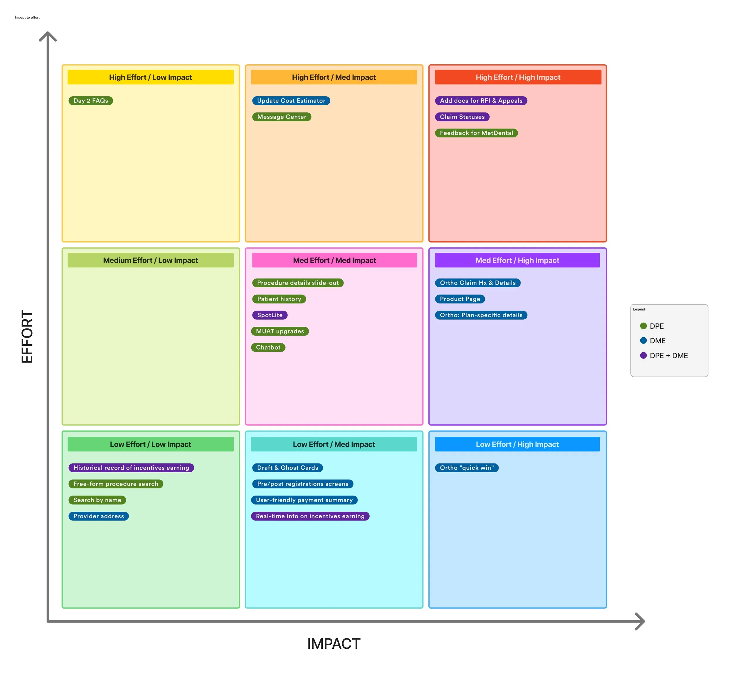
I built a shared Impact/Effort matrix and made every stakeholder plot initiatives against it together, in the same room, replacing two disconnected lists with one shared artifact everyone had to reconcile against.
The dental coverage homepage
Redesigning around what brings people value and piece of mind
Concrete moments
This is the landing screen every member hits first, where they land coming out of their accounts overview into the dental experience. It's the highest traffic screen in the platform, and it was carrying a lot of things nobody was actually using. Behavioral data told us what to keep.
🎯 Decision driver
Users consistently went to the cost estimator first when planning treatment, it was the primary decision anchor, not a secondary tool.
🏠 Homepage value
Coverage summary and cost estimator ranked as the most important homepage elements.
💙 Perceived value
The redesigned spending insights concept scored 4.15/5 in perceived value in testing, especially for call-center users and habitual site visitors.
Final prototype
Prototype of Dental Member Coverage
📱 Device behavior
Desktop and mobile users engaged differently enough that the layout itself had to change, tabs on desktop, vertical scroll on mobile.
Aligning Stakeholders Before Designing Anything
Rather than diving straight into design, I kicked off the provider platform project with a design sprint alongside UXR, bringing together key business and product stakeholders. This surfaced the potential and limitations of the project early, creating shared alignment before a single screen was designed.
Prototype, Test, Iterate
Each team built focused research plans and prototypes tested first internally, then externally with real users, including providers navigating a network of 133,000+ unique locations. Designs were iterated until hitting appropriate quality marks before moving into development.
When engineering surfaced something the design didn't account for
Claim statusing was the single highest effort item on the entire roadmap, and it didn't ship from a fixed spec.
New requirements kept surfacing in the code as engineering got further into it, and design adjusted the same week, not the same quarter.
Design assumption
Show patient specific ortho benefit detail directly in the claim view,it's one of the highest drivers of support calls, so it should be there.
What we shipped instead
Engineering flagged that patient specific data wasn't available at the API level yet. We scoped the MVP around what was actually buildable, and staged the fuller version as a fast follow once the backend caught up.
That was the value of the twice weekly sync. Not reporting status to engineering, but being able to catch the gaps between design knowledge and what the system could do before it became a missed launch instead of a scoped down one.
Outcomes
Impact of the work
🏗 Platform Modernization Prioritized
Full redesign of a legacy platform serving 20M+ members and 478,000+ locations.
🎯 An alignment methodology that outlived the project
Facilitated structured design workshops that aligned business, product, and engineering.
👥 Research made structurally load bearing
Every initiative required a documented hypothesis and evidence before prioritization.
🔬 Compliance-sound workflows, without sacrificing usability
DPPO/DHMO policy logic designed in direct partnership with compliance and legal.
📋 Full Leadership Visibility at All Times
Weekly documented cadence across six parallel workstreams kept every project transparent without status-chasing.
📈 Legible data, at scale
Claims, eligibility, and cost information redesigned around what a member or provider actually needed to decide, not just what the system stored.
What I learned
The hard part was never the screen.
Making dense data legible turned out to be the easier problem. The harder one was building a system where a research backed decision could reliably beat an instinct driven one. Consistently, across a team big enough that no single conversation could hold everyone accountable to it.