Redesigning Veems B2B Payments Workflow
Company: Veem (Fintech), popular payment gateway
Role: Lead UX Designer
Team: Product leader, 1 PM, 3 DEVs, 2 Customer Service Reps.
Platform: Web app
Product: Global payment platform features for businesses to handle digital transactions.
Problem
Veem's Global Payment Transformation
I was hired to redesign Veem’s “pay” and “get paid” features. The payment workflows were convoluted, resulting in low success rates and frequent user abandonment
Prioritizing the top issues
Narrowing down to the most significant issues
I focused on improving the confusing workflow, information architecture, and clarifying what information was required vs optional.
Improving workflows, refining information architecture, and clarifying required vs optional information improves user efficiency, reduces errors, and boosts user satisfaction.
For Veem, these improvements are crucial to ensure secure, swift financial transactions, build user trust, and maintain a competitive edge in a market where user experience can significantly influence user choice and loyalty
Concept Design
3 Different Design Directions
I presented 3 drastically different design directions to solve these issues.
Concept A: Step-by-step wizard
Concept B: Long scrolling page
Concept C: Hybrid of wizard and scroll
Prototyping Phase
Initial Direction
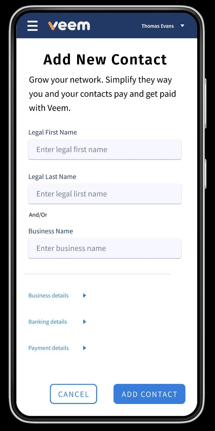
I resolved the confusing workflow by understanding the jobs to be done and cutting the steps from 8 to 4.
The workflows information hierarchy was improved with content organization and type weights to distinguish information and improving the customers focus.
I prioritized required information as the initial input fields and presented optional data through expandable carrot drop-downs.
Data-Driven Design
Merging Analytics with User Experience
Leveraging analytics from the Customer Service team, I identified they were frequently employing "workarounds" to aid businesses in the sign-up process. To address this, I introduced a flexible "business name" input field, allowing customers to proceed with either an individual's name or solely the business name, streamlining the registration experience.
User Testing
Improving Transaction Speed through Testing
Testing revealed an opportunity for a dedicated workflow to handle adding payment information from the Payment Details. Implementing this would expedite customer transactions and improve the overall transaction experience.
Development Collaboration
Hand Off from Design to Development
A particular challenge arose with the implementation of the auto-suggest and predictive search feature. While the initial design was user-centric, it posed technical constraints. Together, the dev team and I:
1. Pinpointed the Issue: Real-time data fetching in the design could slow down search functionality.
2. Devised an Alternative: We modified the design to cache frequent searches, easing real-time data demands.
3. Tested & Refined: After implementing the change, we gathered user feedback and made necessary adjustments.
This process highlighted the importance of aligning design vision with technical feasibility.
Design Challenges and Solutions
Balancing User Experience with Data Collection
A primary challenge was creating forms that met the company's data requirements without sacrificing user experience. Our iterative solution prominently displayed required fields, while optional ones were nested within dropdowns. This approach ensured a user-centric design that effectively balanced data collection with a seamless user journey.
Results
A Successful: 10% Surge in B2B Payments
The redesigned workflows led to a significant 10% increase in B2B payments, marking the project's success.
10% boost in B2B payments
Positive user feedback
Successful feature launch