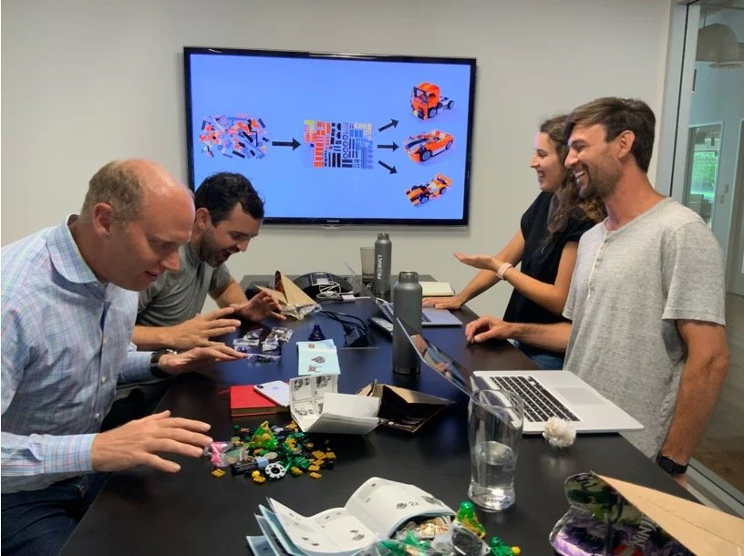
Improving Aduro's end-to-end product development process.
A Design system business case
Background
Aduro's UX team is small and mighty. As apart of the product team, the UX team works closely with the Product Managers, Developers, and various stakeholders to solve problems and build the best products we can. The product team as a whole had various complaints about minor inconsistencies in UI across our stack of products.
Problem
The Product team was noticing lots of small UI errors, like incorrect fonts and colors, in product builds. Small errors like these took a ton of time for the designers, PMs, and engineers to resolve. These errors kept repeating, so we suspected that there might be inconsistencies in the product engineering process. We wanted to investigate what these pain points were and how we might facilitate a smoother overall product development process. That’s where I was brought in. I took a user-centered approach to research our end-to-end product development process, including the workflows of the designers, PMs, and engineers.
My Role
I was the project lead. I worked closely with a research intern Emily Rosenfield to investigate and improve our end-to-end product development process. As a result, I recommended building a design system, an internal product for reusable front-end design and development assets, to facilitate more efficient design-dev communication and front-end engineering.
Process Overview
1. Research
Goals, questions, and strategy.
2. Product Workflow
Visualizing the product teams process.
3. Data for decisions
Ensuring we are moving forward with logical momentum.
4. Prototype
Testing our ideas with users.
5. Implementation Strategy
Suggested strategy for C-suite.
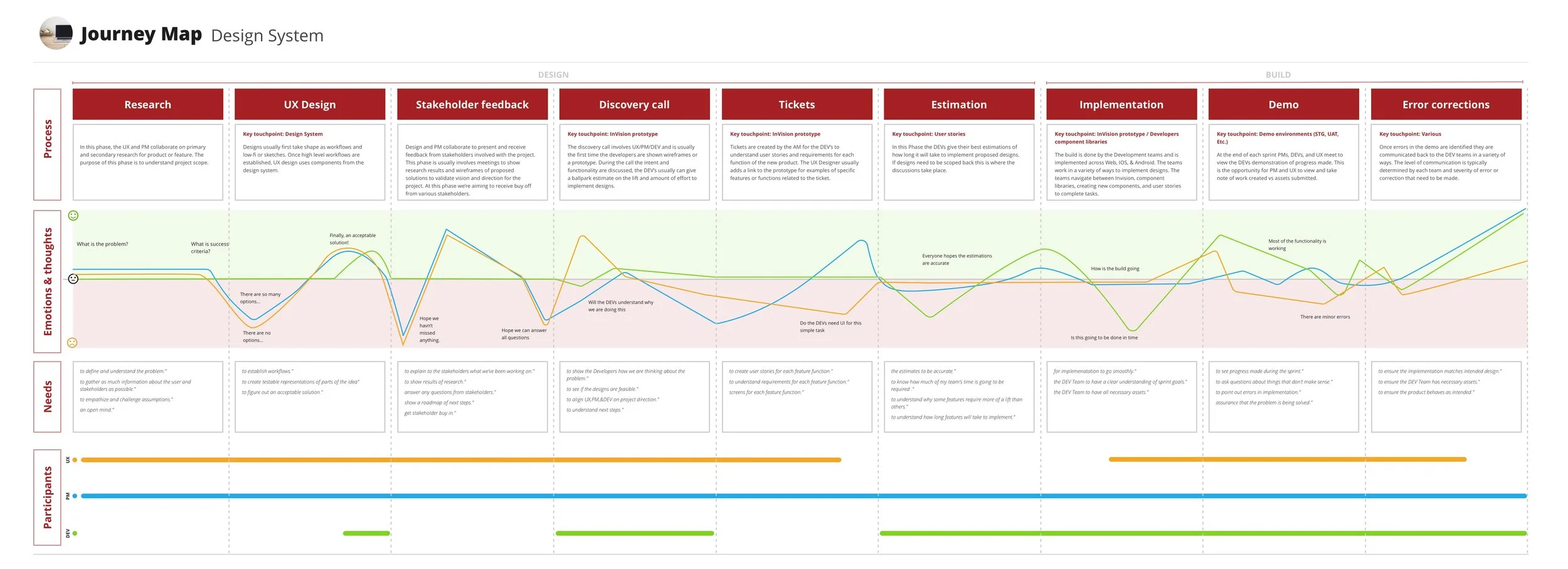
Product Development Workflow
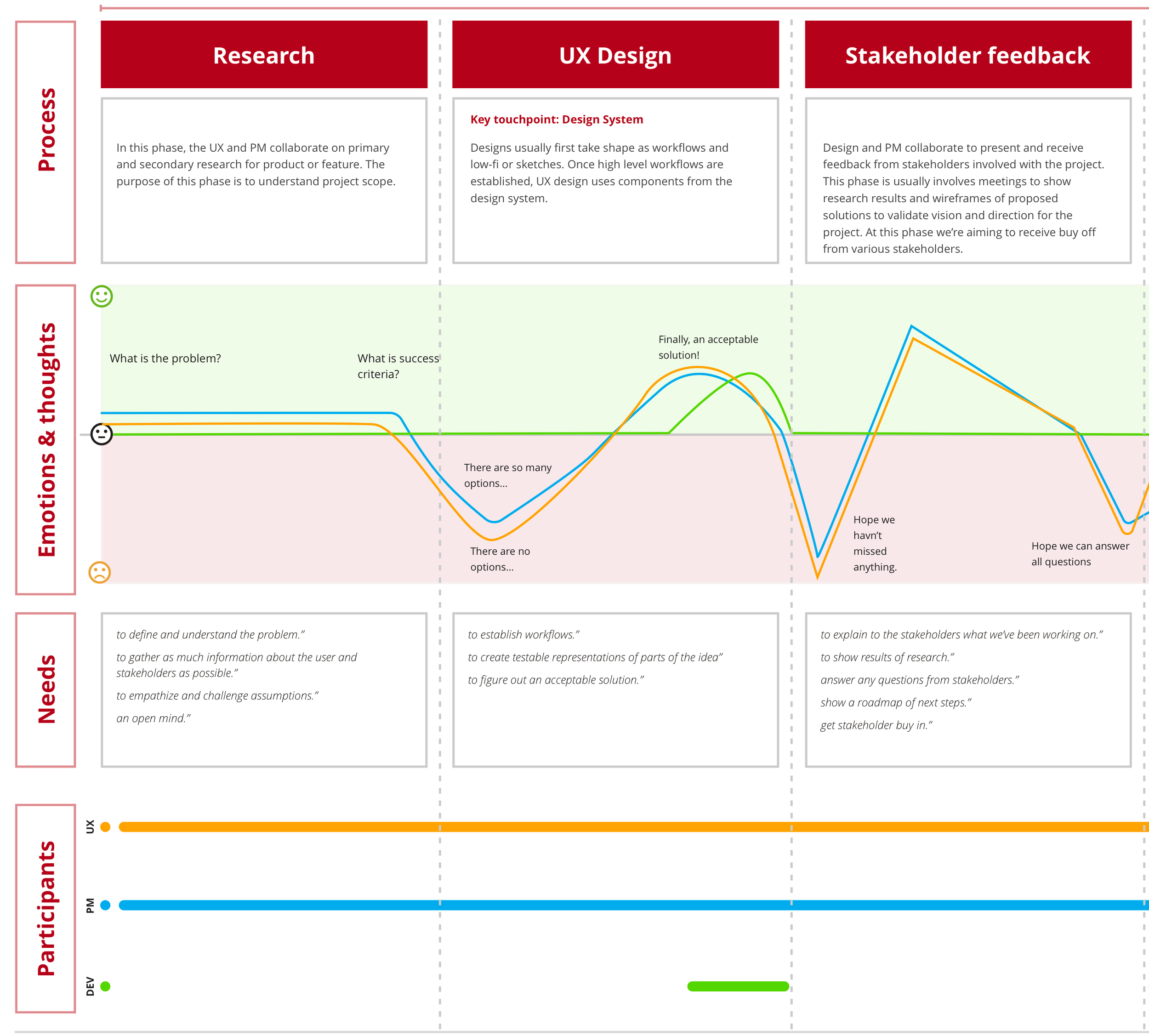
Beginning of the process
To start PM and UX work together to define and understand the problem while gathering as much info as possible.
Initial high-level workflows are established and presented to developers and stakeholders for feedback and buy-in.
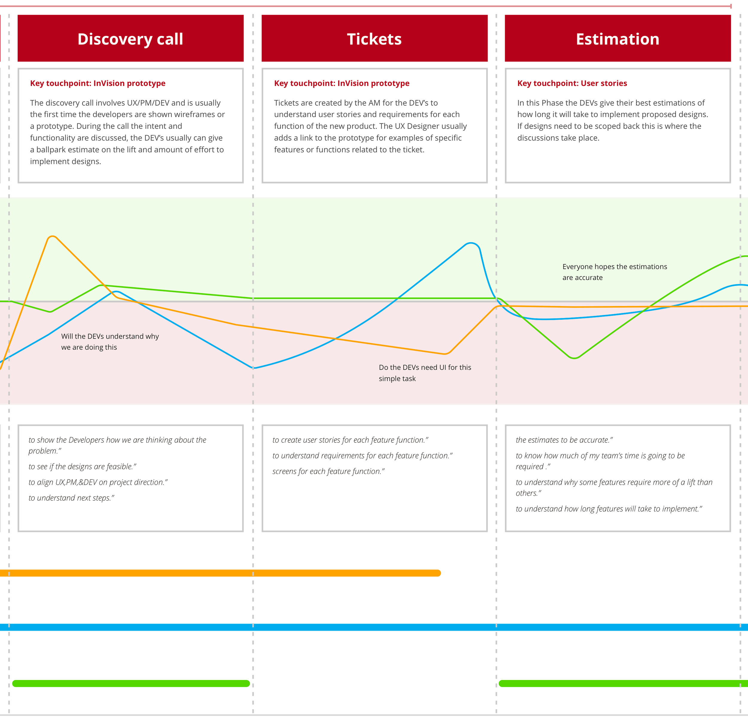
Discovery and Estimation
This phase is comprised of aligning UX, PM, and DEV on the project direction and understanding the next steps.
User stories and lo to mid-fi wireframes are created for each feature function to understand requirements.
Developers make estimates on each story to understand how much of the team's time is going to be required. The estimations help understand how long features will take to implement.
Building
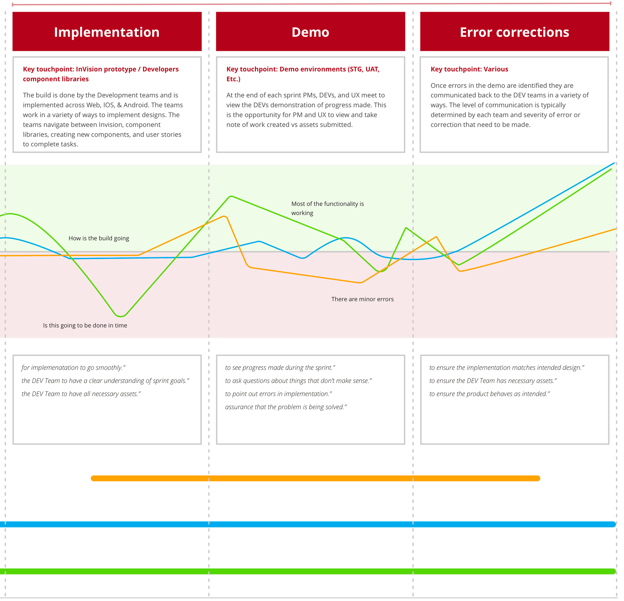
The build is done by the Development team and is implemented across Web, IOS, and Android. The dev team navigates between Invision, component libraries, creating new components, and user stories to complete the tasks.
At the end of each sprint, the Development team demos the progress made. this is the opportunity for PM and UX to view and take note of work created vs assets submitted.
Once errors in the demo are identified they are communicated back to the DEV teams in a variety of ways. The level of communication are typically determined by each team and the severity of error or correction that needs to be made.
Data for Decisions
We boiled down the major problems within the building process to be:
There was a gap between design and development.
The processes for reusing components was inefficient.
Components were inconsistently named.
Our teams were siloed.
Minor UI errors slow the whole team down.
We were failing to meet accessibility standards.
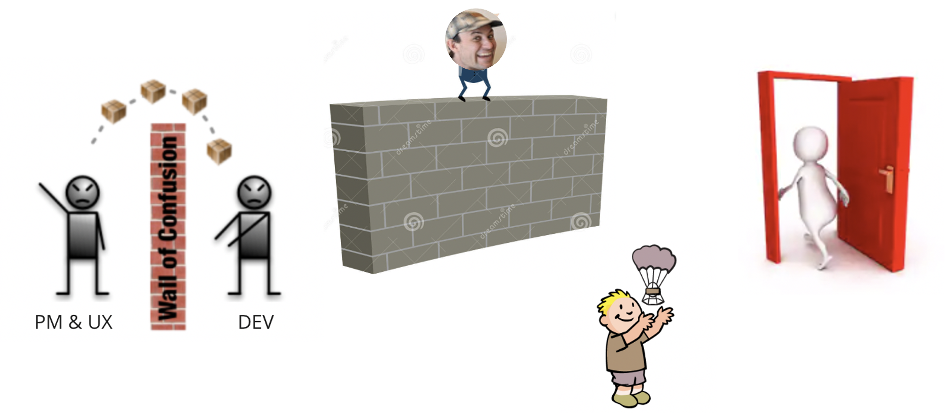
There was a large gap between UX and Development
PMs and UX had moved from throwing our products and features over the "wall of confusion" to our developers.
We were now standing on the wall and tossing our products and features down to our development team. This was an improvement but still not ideal.
What we were aiming for was a door in the middle of the wall so anyone with questions could open the door and get a clear answer.
Survey Results
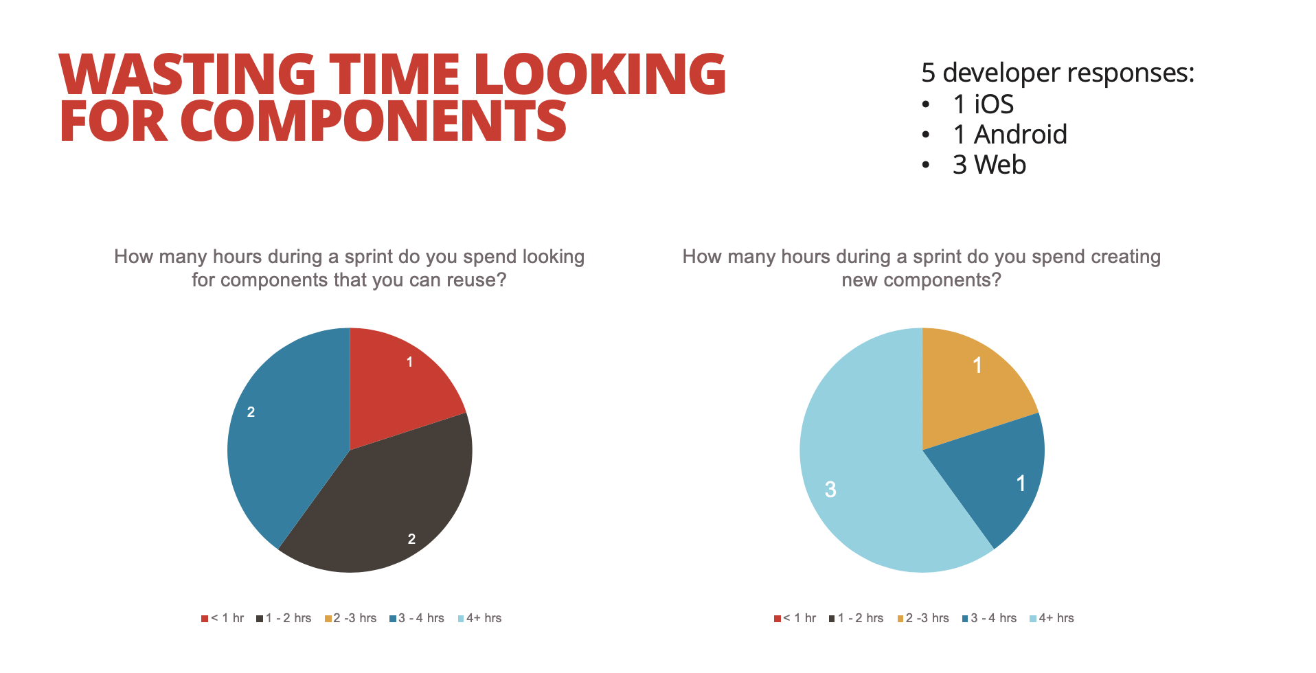
Findings from the survey confirmed that the engineers were spending excessive amounts of time looking for components to reuse or unnecessarily recreating components that already existed in the BitBucket. We also learned that even icons, which should be very straightforward, were hard for developers to find. Minor UI errors affected all team members by a degree of hours each week.
-
5 Developers surveyed
Web, Android, & IOS
-
1 Sprint
1 Sprint = 1 Week
-
8-13 hrs.
Looking for components to reuse
-
17-24 hrs.
Making new components
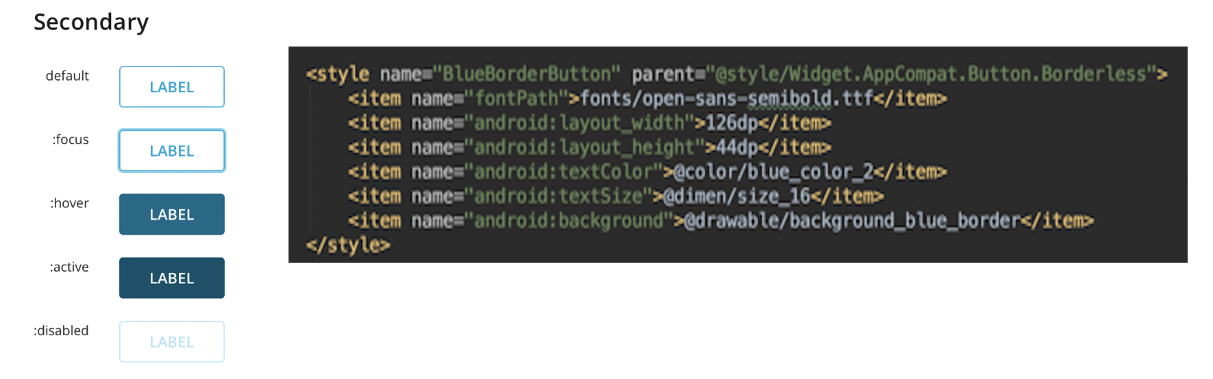
Components were named inconsistently across teams
An example: What the Design team calls “Secondary Button”, an Android developer refers to as “Blue Border Button”
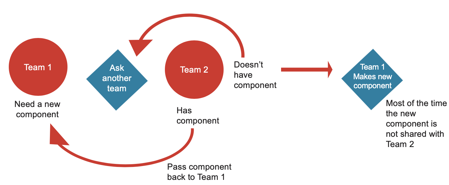
Teams were kind of sharing components...
The different development departments would ask around if they had already made components. This wasn't very effective because most of the time new components were being made in a vacuum and kept on local computers.
Double Checking Components that change states
The UX Team usually doesn’t show button states in InVision assets.
It's too time-consuming to do, requires adding multiple Invision screens.
Devs follow Invision files meticulously and they expect the prototypes to be finished product
If devs notice that they need to account for button states, they will look for that button in previous builds to verify look and feel
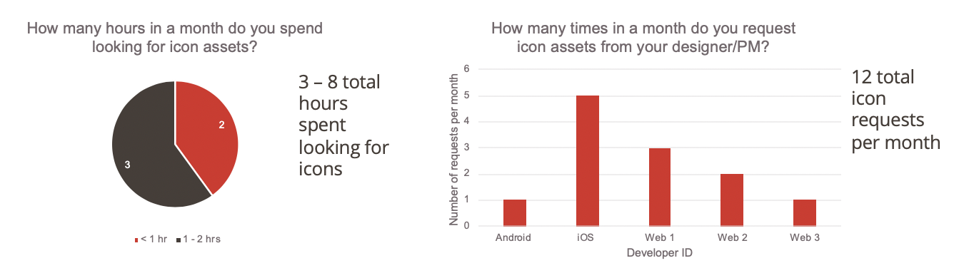
Even something small like icons were slowing us down
The developers reported spending 3-8 hours a month just looking for icons. The IOS team seemed to be making the most requests from the PM or UX team for these icons.
Minor UI errors slowed the whole team down. Minor UI errors weren’t so minor.
UX Team
0 – 4 hours per sprint per designer to respond to developer UI questions.
0 – 4 hours per sprint per designer to communicate UI errors.
PMs
1 – 12 UI error related tickets made per sprint per PM.
5 – 15 minutes to make each ticket.
Developers
Combined, 5 devs, spent 7 – 12 hours making minor corrections to the UI.
Microsoft accessibility audit
One of our products (Connect-Well screening service) was audited by Microsoft before implementing it into their wellness services platform.
29 screen reader bugs where identified. An example of one of these bugs would be an error message that pops up and automatically closes.
If we were going to see accessibility as a priority, we needed to rethink how we design and implement our products.
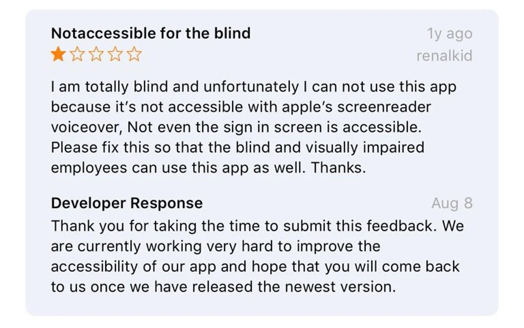
Accessibility Issues
We were letting people down.
Not only was our app inaccessible by Apple's screenreader, but our colors weren't meeting WCAG (Web Content Accessibility Guidelines).
Opportunities identified
Bridging the Dev-UX Gap
The opportunity to bring devs along and challenge them to challenge us with questions and to think bigger about who they are building products for.
Improve product Experience & development
Meeting accessibility standards was table stakes, our products need to meet Web Content Accessibility Guidelines. The Product team and products were scaling and we needed to avoid technical debt.
Prototype
The opportunity was clear
The findings suggest that we needed a solution to help developers reuse code and improve communication across teams by enforcing naming conventions. My coworker Emily and I evaluated possible solutions and decided that a design system might be the best to address these problems. A design system serves as a single source of truth between designers and developers by establishing consistency in product design, development, and component naming.
...But there were risks
Risks of going ahead
Components have to be flexible enough for the developers to want to use.
High upfront investment.
Needed commitment from all teams.
Resource-constrained.
Risks of falling behind
Risk in doing nothing.
Technical debt builds.
Bigger product team = increased need for a design system.
Team morale.
Hindering our innovation.
The goals of our prototype were:
Create a prototype design system to demonstrate a possible solution.
Share research findings with developers.
Get input on solutions from developers & designers.
Propose workflow & touch points with the design system.
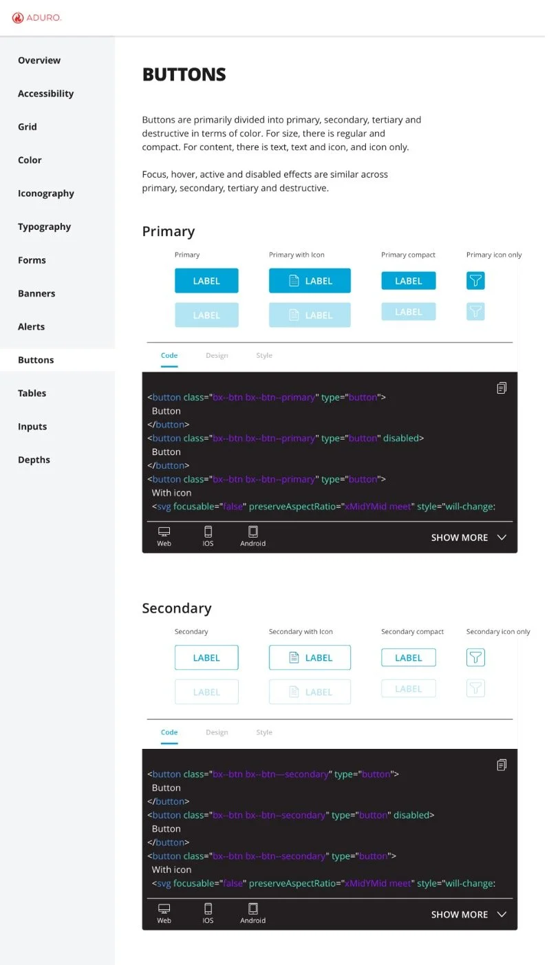
Prototype
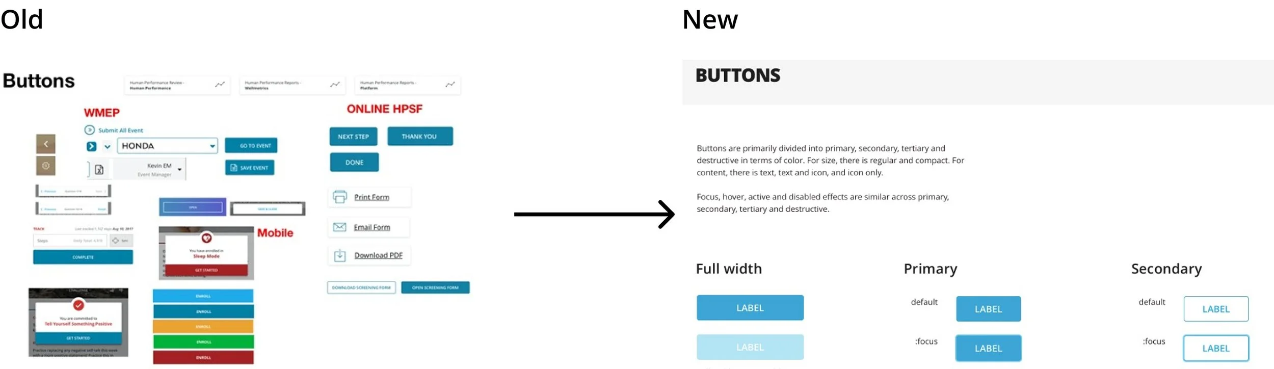
The prototype created was just for the buttons. There is an overview description of the types of button colors, sizes, and content within.
Below the overview, there are examples of the components and tabs for all teams to take advantage of the code for the buttons, design rules for the buttons, and styling of the buttons.
Code tab
The code tab is intended for developers to quickly copy the code from the design system and past it into their environments. There are tabs within each code tab that allows for switching between web, IOS, and Andriod code bases.
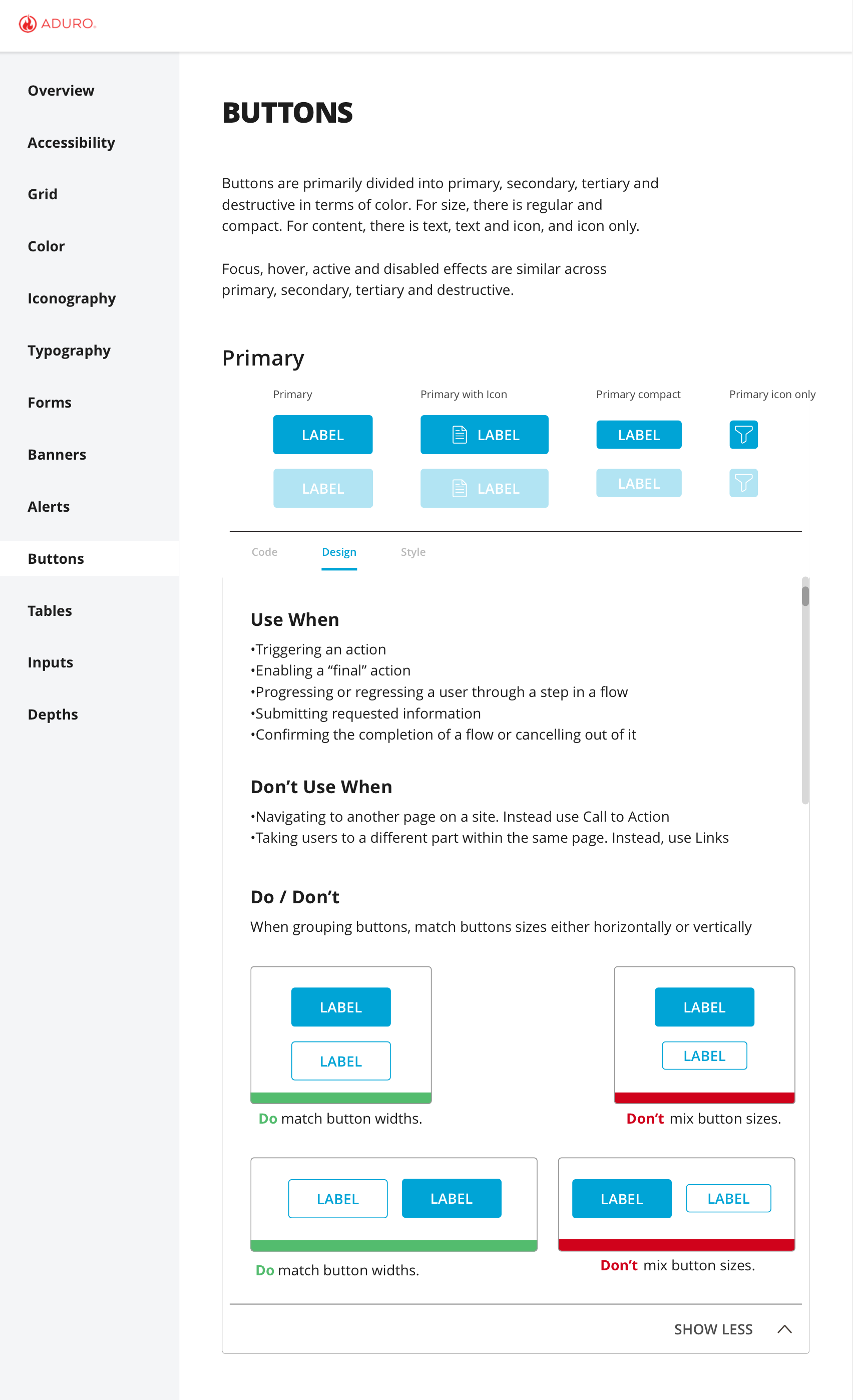
Design Tab
The design tab displays rules for using the components. The rules would be established by the UX team and follow best practices and accessibility guidelines.
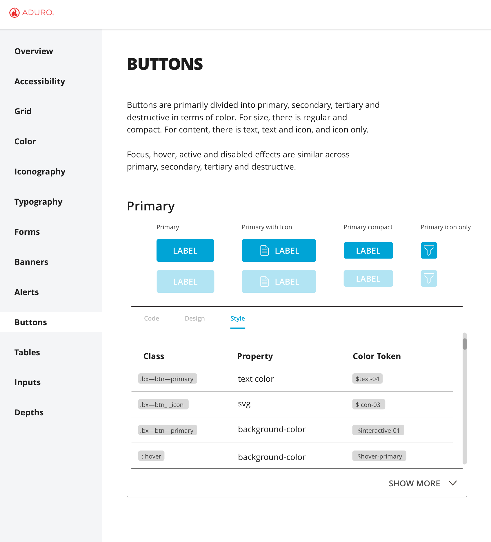
Style Tab
The style tab is intended for component classes, properties, and tokens, these all relate to the styling of the component and allow for quick and easy changes across each instance of the component no matter the platform.
Getting stakeholder buy-in
Getting dev buy-in & input
We shared research findings and the prototype with 4 front end developers. Initially, we thought it did not go well, the devs were in deep thought when we presented the prototype to them. They immediately went too granular with the prototype and started asking technical questions about the components and HEX colors. We were worried that we had offended the engineers with the research by implying they weren’t being efficient. Although our engineers are full employees, they still were coming from a culture of outsourced labor where efficiency is a very important quality. This was a common problem for us because of language and cultural differences (our developers are all in Vietnam). Because of this blocker, we reached out to our supporting PMs for advice and suggestions as to how to get the feedback we were looking for.
We shared the prototype again with the advice from the PMs and were able to get some great feedback. Some key insights were:
They were insistent on using the inspect feature (right-click, inspect).
Excited about how this might save them time.
Concerned about time to implement and how it will affect their workload.
It turned out that they were very excited about the design system and wanted to continue pursuing it as an idea.
Getting business buy-in & input
Design systems require a lot of resources up front, but over time the investment pays off in time saved - as designers and engineers get time back to focus on innovating and solving bigger problems. To develop a design system, we would need to get buy-in from executive leadership.
In order to get the business to buy into our idea of a design system, we created a business case and explained our current process for building products, the pain points of our current process, explained what a design system is, the benefits of a design system, showed our prototype, the feedback from Development, PMs, and UX, and our proposed implementation strategy.
Implementation Strategies
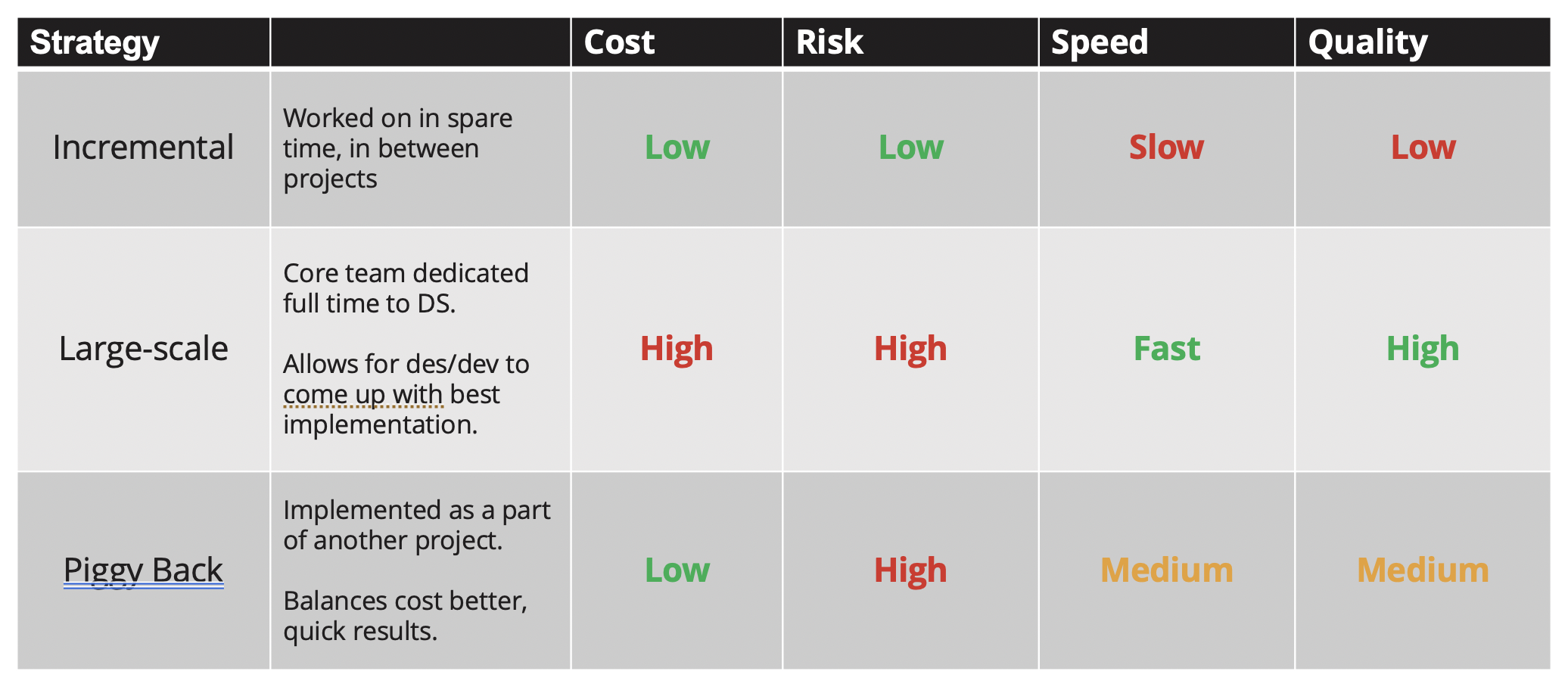
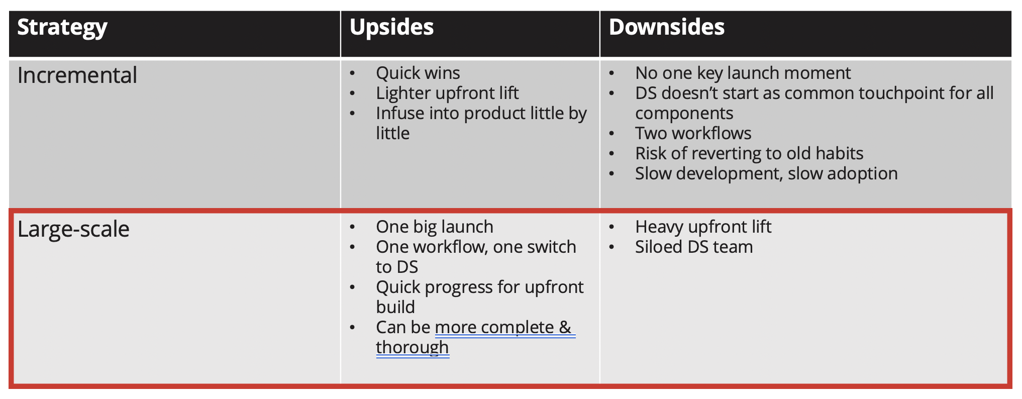
Large-scale implementation
We advocated for a large-scale implementation strategy. This strategy would require a small team to develop the design system and then launch it all at once to our other designers and developers. This strategy seemed most appropriate for our users because it creates one exciting launch and then everyone switches to incorporating the design system into their workflow.
“Minimizes a lot of visual design feedback so we can focus more on the layout and experience.”
— UX Designer, Aduro
Takeaways from the project
This was a fun project to work on. I really enjoy working with the teams in order to show the business how we can improve our processes and the quality of our work. Working with an intern was also super fun, I really enjoy teaching and guiding people that are truly interested in learning.
Shout out to Emily Rosenfield for being extremely curious and super dedicated to the project. She was paramount in creating such a detailed report in such a small amount of time. She was great with coming up with and bouncing ideas off of and we were able to convenience the business that a design system would be an intelligent decision.
Some challenges were; showing the developers how we could improve the process without offending them or degrading their current work processes. It's a tricky subject to show someone that their workflows are insufficient and would create large technical debt if they kept to the process they were used to. Cross-cultural collaboration is another tricky area. I relied on and collaborated with other team members in Vietnam that I had built a good relationship with when traveling there for previous projects.
The final presentation to the CEO & CPO went really well
According to our CEO, it was the best presentation he’d seen at ADURO.